@media screen and (min-width: 959px) and (max-width: 1177px){body{overflow-x:hidden}.boxed,.boxed-margin,.row{width:96% !important}.scroll{overflow:auto}.Alphabet li a{padding:4px 10px}.wtext a{font-size:12px}}
@media screen and (min-width: 760px) and (max-width: 958px){body{overflow-x:hidden}.boxed,.boxed-margin,.row{width:96% !important}.boxed-margin{margin:8px auto}.vc_col-sm-1,.vc_col-sm-10,.vc_col-sm-11,.vc_col-sm-12,.vc_col-sm-2,.vc_col-sm-3,.vc_col-sm-4,.vc_col-sm-5,.vc_col-sm-6,.vc_col-sm-7,.vc_col-sm-8,.vc_col-sm-9,.grid_1,.grid_2,.grid_3,.grid_4,.grid_5,.grid_6,.grid_7,.grid_8,.grid_9,.grid_10,.grid_11,.grid_12{width:100% !important}.scroll{overflow:auto}article.grid_3,article.grid_4,article.grid_6{width:48% !important}.jp-mute,.jp-unmute{display:block !important}table th,table caption{padding:4px 8px}.little-head{float:none !important;display:table;margin:0 auto}.logo{float:none !important;display:table;margin:28px auto 14px}header .mobile_nav,header #mobile,.header_4 > .row:first-child,.header_4 .little-head,.full_menu{display:none}header .mobile,.header_4 #mobile{display:block}.header_4 .full_menu{position:absolute;right:20px;top:6px}.overlay_header{top:0 !important;margin:0 !important}.ajax_player .jp-type-playlist{margin:0}.ajax_player .jp-playlist,.scroll{overflow:scroll !important}.player_popup {overflow: hidden !important}}
@media screen and (min-width: 480px) and (max-width: 759px){.admin-bar .ONsticky{top: 0 !important}body{overflow-x:hidden}.boxed,.boxed-margin,.row{width:96% !important}.boxed-margin{margin:8px auto}.grid_1,.grid_2,.grid_3,.grid_4,.grid_5,.grid_6,.grid_7,.grid_8,.grid_9,.grid_10,.grid_11,.grid_12{width:100% !important}article.grid_3,article.grid_4,article.grid_6{width:48% !important}.social-head{margin:0 10px 0 0}.little-head .search{margin:2px 0 0}.little-head .search > input{font-size:12px;width:300px !important}.little-head{padding:10px 5px 8px}.ONsticky{position:relative !important}.logo{float:none !important;display:table;margin:28px auto 14px}header .mobile_nav,header #mobile,header .social,.header_4 > .row:first-child,.full_menu,.header_4 .little-head,.ajax_current_title,.Corpse_Sticky{display:none}header .mobile,.jp-unmute,.header_4 #mobile{display:block !important}.modern .ajax-item{width:100% !important;position:static !important}.header_4 .full_menu{position:absolute;right:20px;top:6px}.fullscreen_menu .sf-menu a{padding:0 0 10px 0;font-size:20px}.overlay_header{top:0 !important;margin:0 !important}.popup{width:70% !important}.ajax_player .jp-type-playlist{margin:0}.events_table td{width:100%;display:block}.ajax_player .jp-playlist,.scroll{overflow:scroll !important}}
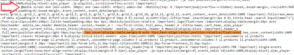
@media screen and (min-width: 100px) and (max-width: 479px){.admin-bar .ONsticky{top: 0 !important}body{overflow-x:hidden}.boxed,.boxed-margin,.row{width:96% !important;padding:0}.boxed-margin,.event_content,.event_date{margin:8px auto}.grid_1,.grid_2,.grid_3,.grid_4,.grid_5,.grid_6,.grid_7,.grid_8,.grid_9,.grid_10,.grid_11,.grid_12,.event_content,.event_date{width:100% !important}.fullscreen_menu .sf-menu a{padding:0 0 10px 0;font-size:20px}.social-head{margin:0 10px 0 0}.social a{width:17px}.little-head .search{margin:2px 0 0}.little-head .search input[name=“s”]{font-size:12px;width:140px}.little-head{padding:10px 5px 8px}.ONsticky{position:relative !important}.logo{float:none !important;display:table;margin:28px auto 14px}header .mobile_nav,header #mobile,header .social,.header_4 > .row:first-child,.full_menu,.header_4 .little-head,.cart_head,.ajax_player .has_cover,.ajax_current_title,.Corpse_Sticky{display:none}header .mobile,.jp-unmute,.header_4 #mobile{display:block !important}.header_4 .full_menu{position:absolute;right:20px;top:6px}.has_cover{display:table;margin:0 auto 32px;text-align:center;position:relative;float:none!important}.has_cover_content{width:100% !important}.classic h3{margin:20px 0 0;display:inline-block}.modern .ajax-item{width:100% !important;position:static !important}.woocommerce ul.products li.product,.woocommerce-page ul.products li.product,.woocommerce-page.columns-3 ul.products li.product,.woocommerce.columns-3 ul.products li.product{width:100% !important;margin:0 0 20px !important}li.bbp-forum-info,li.bbp-topic-title{width:100%}li.bbp-forum-freshness,li.bbp-topic-freshness{width:100%}.countdown{width:100%}.countdown li{width:21%}.overlay_header{top:0 !important;margin:0 !important}.popup{width:70% !important}.single-events .button.large{float:none;text-align:center;display:block;margin:0 0 22px}.ajax_player .jp-type-playlist{margin:0}.events_table td{width:100%;display:block}.ajax_player .jp-playlist,.scroll{overflow:scroll !important}}
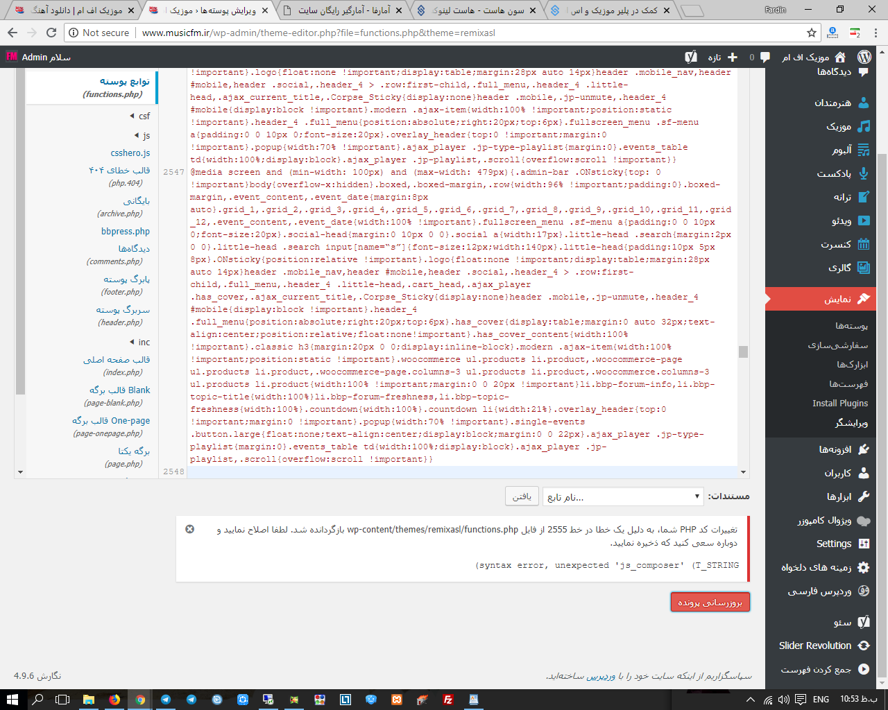
کد بالا رو اصلاح کردم جایگزین کد هاتون کنید